|
 |
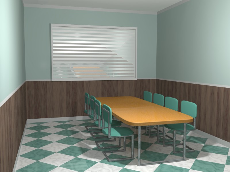
"Slime" <fak### [at] email address> wrote:
> It looks kind of flat. You need to increase the contrast in the lighting -
> mostly, make the shadows darker. Maybe even consider a spotlight to
> deemphasize the background. Also, the reflectance of the table and chair
> legs makes them look very busy; you could reduce the reflection or maybe
> fiddle with variable reflection or other finish properties.
In this version I'm using radiosity with an area light and also a fill light
at the eye location. I've reduced the reflection of the chrome.
>
> The chairs on either side of the table are very packed together, in contrast
> to the rest of the scene which has empty or solid-colored areas. Try
> rearranging objects (or giving the chairs more space) to even things out a
> little.
I'm now randomizing the xz floor position & y rotation of the chairs. I'm
also using repeat & black-hole warp on the wood panelling. Also, instead of
using a single box for the whole room, the walls, floor & ceiling are
seperate boxes now.
> Finally, the perspective of the scene isn't very interesting. It's a head-on
> point of view that doesn't give a good sense of depth. I suggest rethinking
> the camera setup.
Done. I've also added a water plane so the room doesn't look like its
floating in the air, but it doesn't like quite right yet: the
water level looks too high, like the water is going to come through the
window. :( Anyway this version renders much faster. :) The
window shutter is just a low reflectance mirror with a triangle_wave
normal.
> Keep working on it!
>
> - Slime
Thanks for the suggestions & encouragement. address> wrote:
> It looks kind of flat. You need to increase the contrast in the lighting -
> mostly, make the shadows darker. Maybe even consider a spotlight to
> deemphasize the background. Also, the reflectance of the table and chair
> legs makes them look very busy; you could reduce the reflection or maybe
> fiddle with variable reflection or other finish properties.
In this version I'm using radiosity with an area light and also a fill light
at the eye location. I've reduced the reflection of the chrome.
>
> The chairs on either side of the table are very packed together, in contrast
> to the rest of the scene which has empty or solid-colored areas. Try
> rearranging objects (or giving the chairs more space) to even things out a
> little.
I'm now randomizing the xz floor position & y rotation of the chairs. I'm
also using repeat & black-hole warp on the wood panelling. Also, instead of
using a single box for the whole room, the walls, floor & ceiling are
seperate boxes now.
> Finally, the perspective of the scene isn't very interesting. It's a head-on
> point of view that doesn't give a good sense of depth. I suggest rethinking
> the camera setup.
Done. I've also added a water plane so the room doesn't look like its
floating in the air, but it doesn't like quite right yet: the
water level looks too high, like the water is going to come through the
window. :( Anyway this version renders much faster. :) The
window shutter is just a low reflectance mirror with a triangle_wave
normal.
> Keep working on it!
>
> - Slime
Thanks for the suggestions & encouragement.
Post a reply to this message
Attachments:
Download 'tablechairs8c.jpg' (70 KB)
Preview of image 'tablechairs8c.jpg'

|
|